Nescafé Rebrand
Nescafé is a coffee brand that provides people with instant delicious coffee. Their current brand is outdated and needs a rebrand to better represent who they are and what they have to offer. This new look is more modern and will help the brand stand out and speak out their mission: to provide people with great tasting coffee.
2023
• Brand Identity
• Packaging Design
Tools
• Illustrator
• Photoshop
Logo
Nescafé’s old logo is iconic, recognizable, and works really well. The logo remains the same with only small edits made to the typeface and the color of the accent mark changing to brown to represent coffee.
Colors
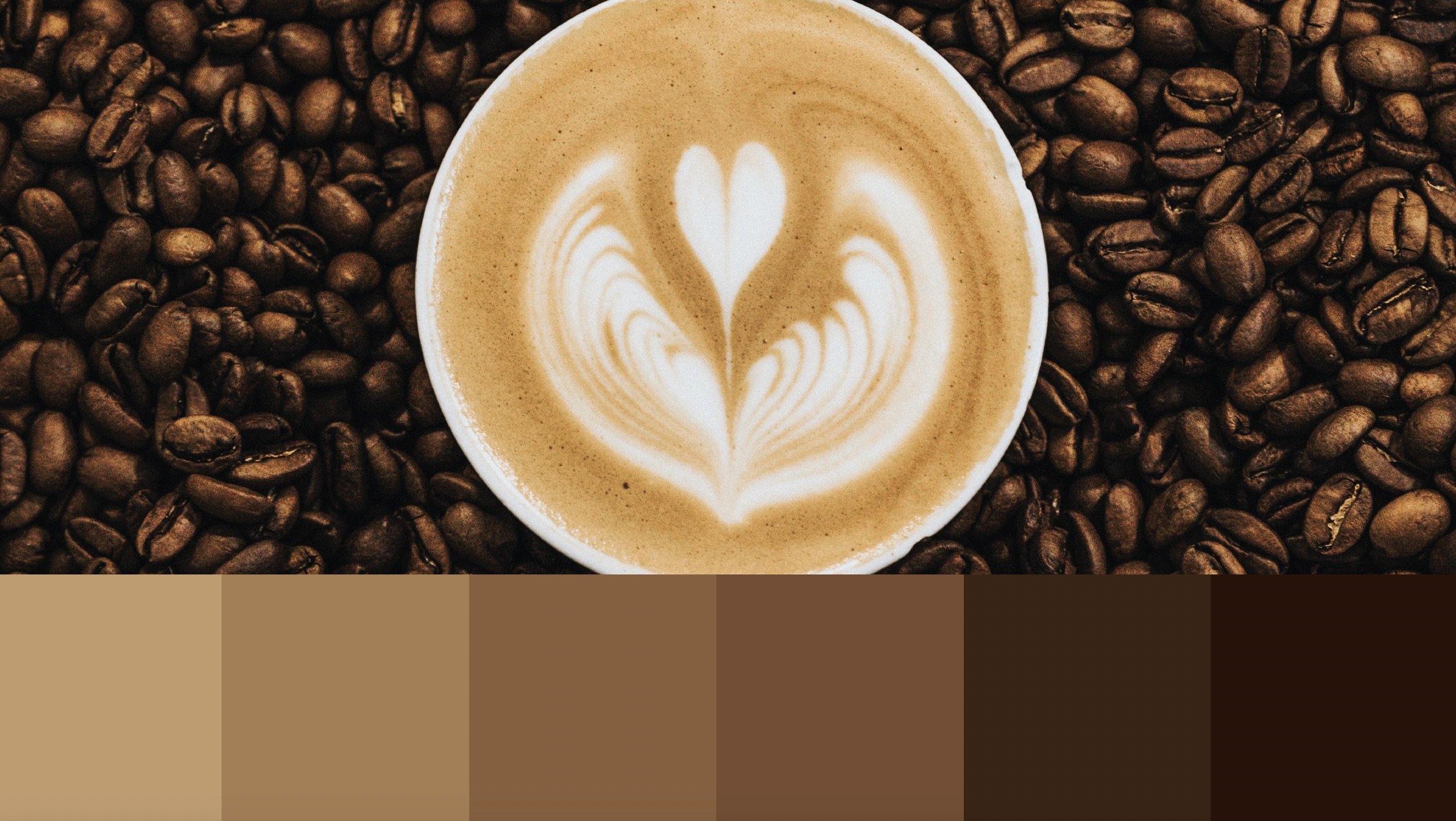
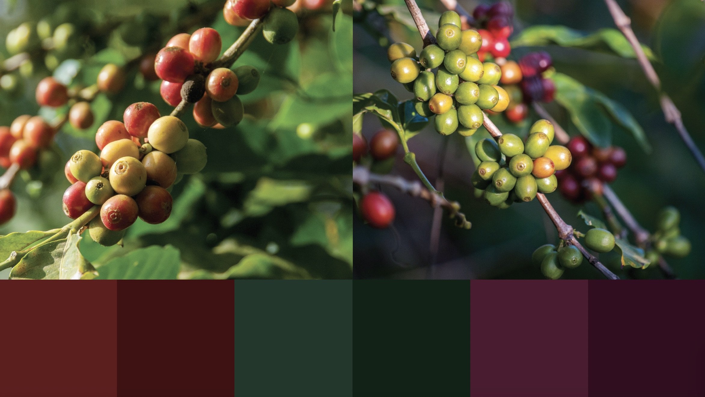
The new color palette for the rebrand is inspired from the coffee making process. The brown comes from a cup a coffee and the different shades it comes in. Paying homage to Nescafé’s old packaging, the deep rich colors come from nature and the coffee plant.
Logo + Color
Packaging
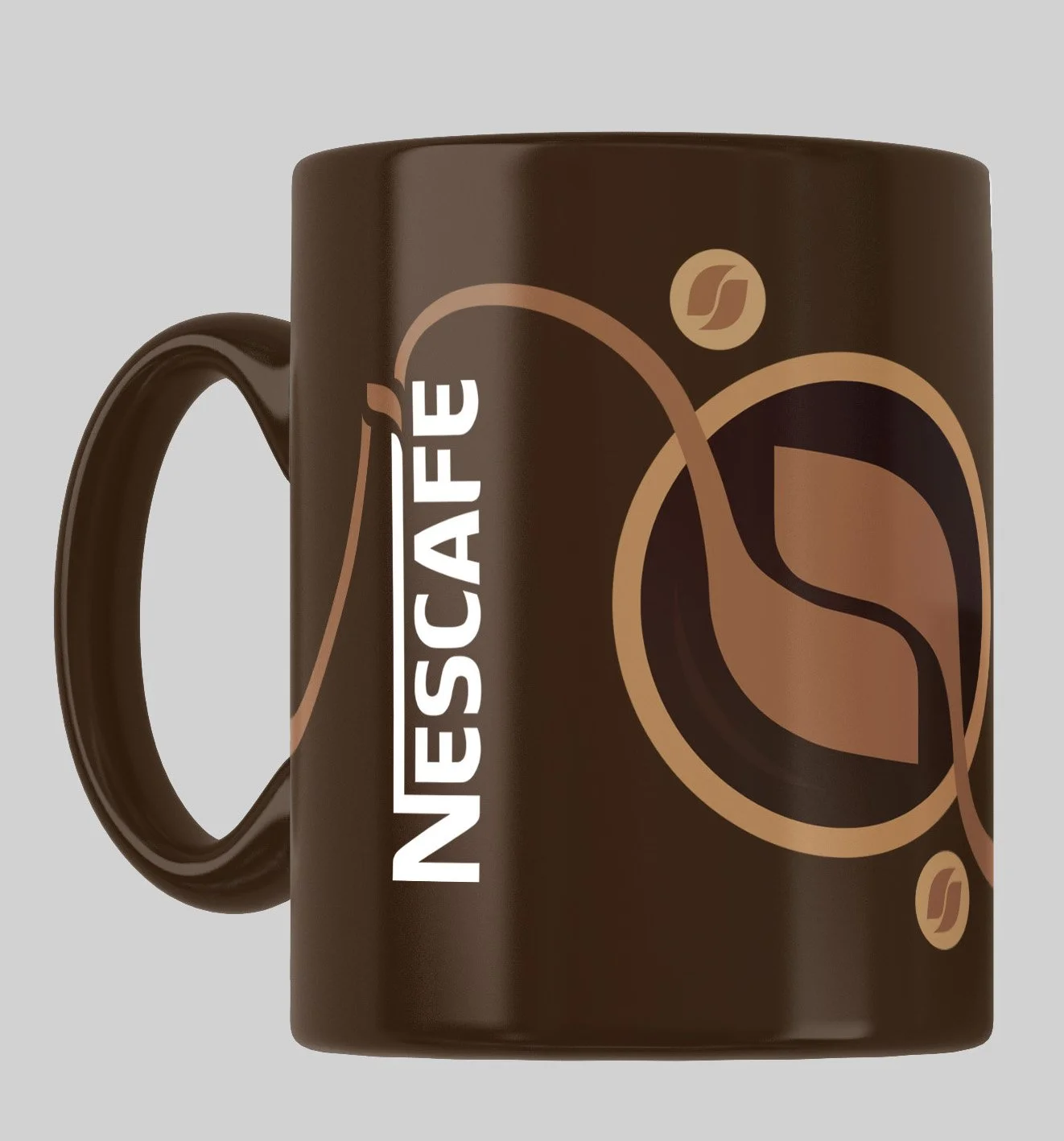
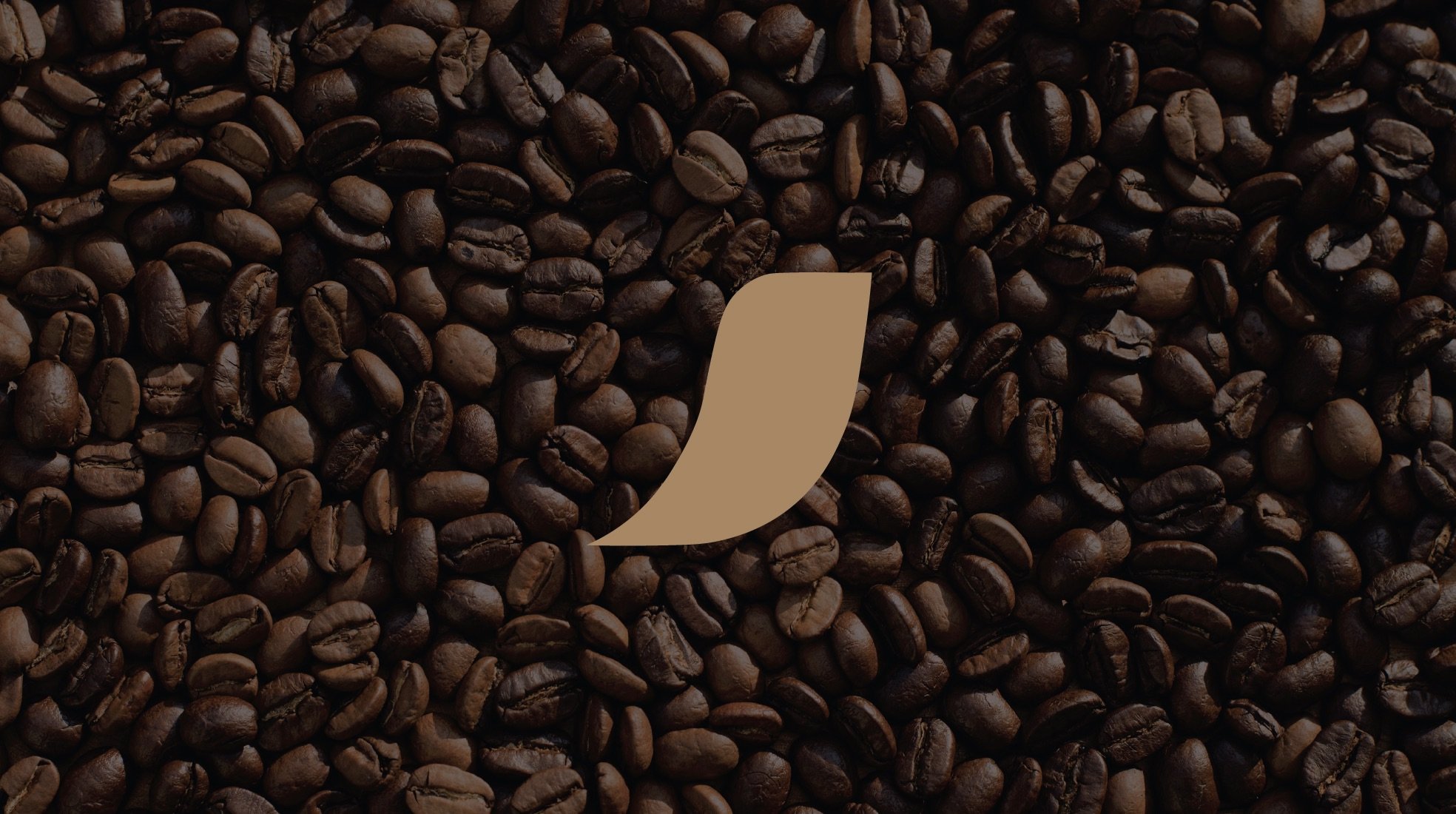
For the new packaging, the second color palette seen before is used. The coffee bean symbol was created using the accent mark on the logo. To represent that Nescafé offers quick delicious coffee, the coffee bean forms from the accent on the logo then ends at the bottom, like pouring coffee in a cup. This form is repeated on the side of the packaging. There’s a circle behind the coffee bean, similar to what Nescafé’s old packaging has, representing the top of a coffee mug.
Components + Advertising
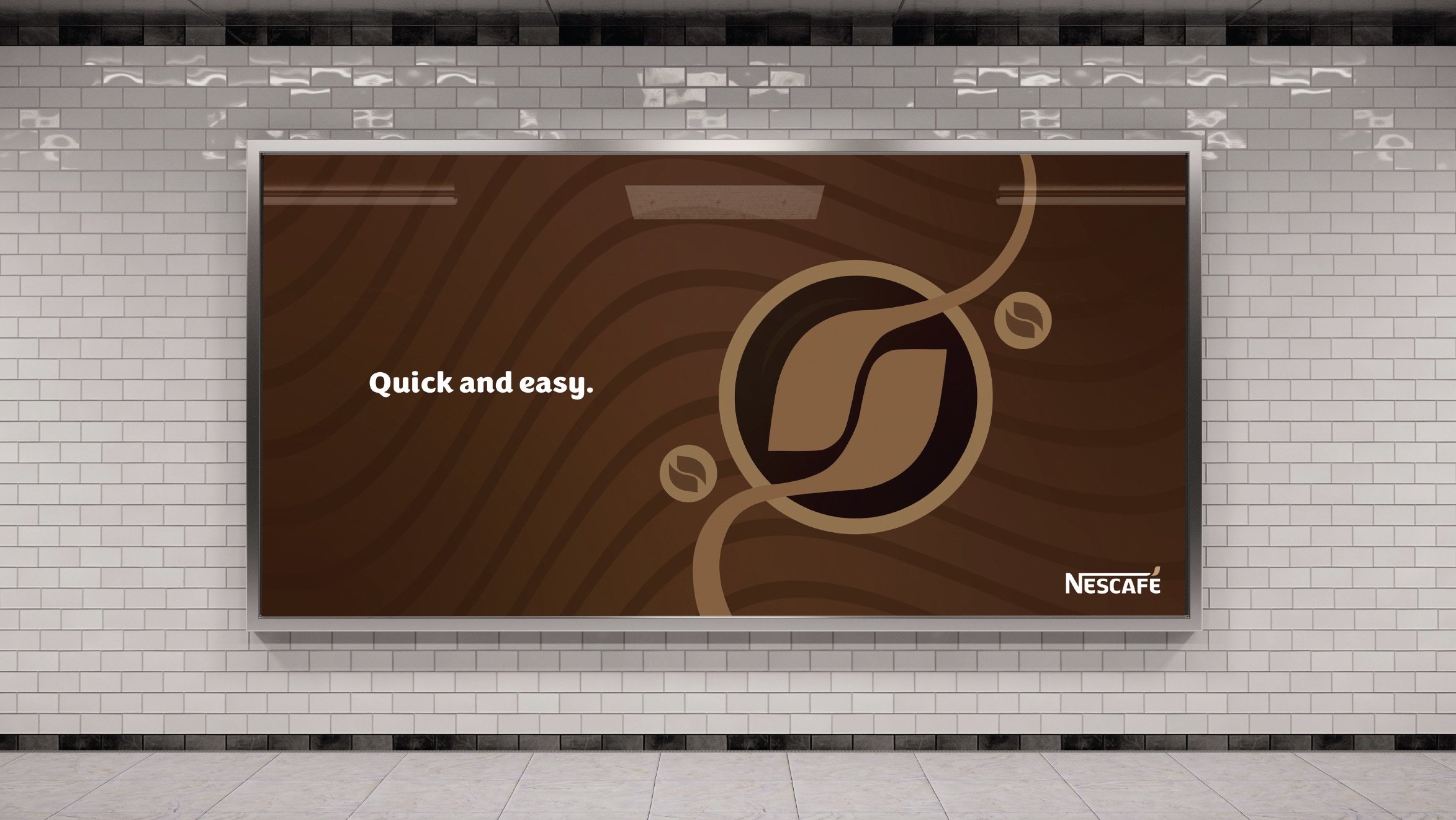
The patterns for the brand are made with the elements seen on the packaging. The coffee bean mark can be used for advertising, like bus stop ads and billboards. There are many ways to use the mark with images, which creates contrast and makes the mark stand out. The mark will be recognizable by many people and the connection to Nescafe’s mission and connection to coffee will be stronger.

